Discover how to harness the power of the Golden Ratio in your designs! This age-old number helps you create perfectly-balanced layouts, images, typography and much more.
Get Started for FREE
Sign up with Facebook Sign up with X
I don't have a Facebook or a X account


 Your new post is loading...
 Your new post is loading...
Your new post is loading...
Discover how to harness the power of the Golden Ratio in your designs! This age-old number helps you create perfectly-balanced layouts, images, typography and much more. 
No comment yet.
Sign up to comment

What do you do when someone hands you a flyer on the street or when you find one hidden among the bills and papers in the mail? Do you read it with eager anticipation? Or do you throw it away without giving it a second glance? Really, when was the last time you got a…
PIRatE Lab's insight:
Share your insight

Bullet points suck big time. They put your audience to sleep. Learn 7 alternatives ways to present your information in a more engaging way. Via Baiba Svenca

Baiba Svenca's curator insight,
October 30, 2015 12:01 PM
Once again - bullet points and their alternatives. Learn how you can have your cake and eat it too.

Is it safe to park on the street, or are you risking a ticket? The more signs there are, the more confusing that question gets. Designer Nikki Sylianteng has found a way to help.
PIRatE Lab's insight:
Great design!

The US, China, India and most of Europe could fit inside Africa and there'd still be room.

Duarte creates presentations and offers training based on our unique VisualStory™ methodology, which applies storytelling and visual thinking to craft persuasive communications designed to shift audience beliefs and behaviors
PIRatE Lab's insight:
This is good watch for those of you new to giving talks. The presentation techniques are a bit obvious and I have a bit of a problem with her having "suddenly" discovered this, but the lessons are nevertheless a good suggestion for a place to start.
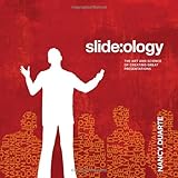
slide:ology: The Art and Science of Creating Great Presentations [Nancy Duarte] on Amazon.com. *FREE* shipping on qualifying offers. No matter where you are on the organizational ladder, the odds are high that you've delivered a high-stakes presentation to your peers
PIRatE Lab's insight:
This looks to be a good reference for slide design.
Basic tutorial on Raw, an online app for designers and vis geeks, aiming at providing a missing link between spreadsheet applications (e.g. Microsoft Excel, Apple…
Sometimes it can be a challenge to produce data graphics in vector format, which is useful for high-resolution prints. Raw, an alpha-version tool by Density Design, helps make the process smoother. Try the application here: raw.densitydesign.org
PIRatE Lab's insight:
I quite like this tool. It is still a bit limited at the moment, but if it happens to work for you particular graphing needs, take this sucker for a spin.

As content curators, we sometimes think we might not have anything super interesting to say or struggle to add value on top of the message within the content we’re curating — but your insight is invaluable and an incredibly important part of the curation and knowledge sharing process. Here are a few ways to re-spark your creativity while curating! Enjoy!
PIRatE Lab's insight:
This is something of a pat approach to "creativity" but it still is worth a quick glance. If you have not tried all of these, give them a shot next time you are stuck staring at a blank screen.
PowerPoint, Keynote, and Skyrocket can create some great visual aids. Sadly, many presenters have never been taught the principles of presentation slide design. Via Baiba Svenca
PIRatE Lab's insight:
Generally, the best answer is NO ANIMATIONS. And almost never any of the sound effects. More on this on Monday...

Ali Anani's curator insight,
February 2, 2014 12:12 AM
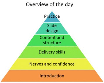
The pyramid of designing slides for presentations 
Don Karp's curator insight,
February 10, 2014 11:52 PM
Useful tips on animation plus a link for "how to" with PowerPoint. |
From
medium

Design thinking is a popular concept in design. This article explains basic ideas of design thinking, and lists design thinking tools and various resource collections. In the article “What Is Design…

Discover how the Star Wars logos transformed over four decades to become one of the most well-known icons in all of pop culture.
PIRatE Lab's insight:
A great example of design choices.
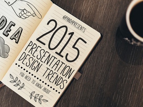
Presentation Design Tips | Similar to websites, presentation design trends change over time. Follow these 5 presentation design trends and wow your audience! Via Baiba Svenca

Jasmin Davies-Hodge's curator insight,
June 9, 2015 5:51 AM
Thank you @Baiba Svencabbb for sharing :)

The share of Americans who say they're looking forward to the Winter Olympics.
PIRatE Lab's insight:
Example of a cruddy graphic. This horizontal bar graph is a bit bizarre. What is the ordering they used? Alphabetical? No. High to Low? No.

SMBC pokes fun at big "informational" graphics with a self-referencing graphic that displays 6 reasons why said graphic is useful. It's not so much the size as it is the non-information displayed as something worth knowing. At least one of these things lands in my inbox per day, and it always surprises me. Do people still share these things? I mean, these non-information graphics were popular five years ago, and there was a novelty aspect, but I rarely see them in my feed these days. See also the big graphic blueprint and a tall infographic.

A visualization system, scientifically designed with your info in mind. Find the perfect diagram and download the PowerPoint-ready file for just $0.99.
PIRatE Lab's insight:
These are okay shapes. I don't find them particularly useful, but some of you might. If so, $0.99 is a good deal.

With only a web browser, you have the means to visualize collected data in an interactive form that will allow you to apply the results.
PIRatE Lab's insight:
More potential tools that may ease your analyses.

Josh Stevens, a PhD candidate at Penn State, mapped 92 years of sasquatch sightings, based on data from the Bigfoot Field Researchers Organization. Before you furiously type that the map is just population density, Stevens addresses that.
PIRatE Lab's insight:
A great example of merging a well-designed map with a line graph.

There are a lot of charts to choose from, and if you pick the wrong one you'll end up communicating the wrong message or make it hard for others to read your data. Luckily, Juice Analytics has you covered with an interactive Chart Chooser, based on Andrew Abela'sflowchart from a few years ago.
There are toggle buttons on the top that let you filter based on what you're looking for, such as a trend or relationship. For example, if you select comparison, distribution, and composition, you're left with a bar chart. Don't care about distribution? You can also try a stacked bar chart.
PIRatE Lab's insight:
I actually thought this was an okay post until I tried to use it. While no such "chart picker" dichotomous key will ever be the end all be all of graphing, this has grown on me. I think you will find this a useful aid when you are starting out and trying to figure out how to go about selecting a figure type to present your data.
"Dear NSA, You can do whatever you want with my data. But not with my eyes."
PIRatE Lab's insight:
A great example of how well designed slides can be a massive improvement in clarity.
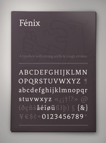
We've scoured the web to present you with a fine and varied selection of free fonts. Including scripts, serifs, and a range of ligatures, these fonts will give you greater flexibility in your designs, and add to your arsenal of design tools. This list represents the 100 best free fonts we've found in a variety of styles.
PIRatE Lab's insight:
Great selection of fonts for presentations.
|