

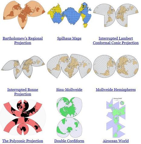

"In some ways, all 2D maps of Earth are interrupted at some point, even if it’s just along the antimeridian at 180°. Interruptions are often in areas of less interest e.g. oceans for a land-focused map."
Get Started for FREE
Sign up with Facebook Sign up with X
I don't have a Facebook or a X account


 Your new post is loading...
 Your new post is loading...
Your new post is loading...
"In some ways, all 2D maps of Earth are interrupted at some point, even if it’s just along the antimeridian at 180°. Interruptions are often in areas of less interest e.g. oceans for a land-focused map."
Tony Hall's insight:
This is really, very cool! A fantastic way to visualise the differences between map projections to illustrate the variation in land shape, land area and land size. Also an excellent discussion starter. 
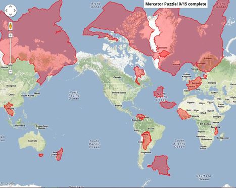
Tony Hall's insight:
This is great fun! A little tricky at first though:)

Kristen McDaniel's curator insight,
February 11, 2013 12:03 PM
Great site to show projection and changes in perception on maps. 
John Nieuwendyk's curator insight,
December 17, 2014 5:45 PM
This mercator puzzle was especially interesting. It illustrated how various countries look on a mercator map compared to other maps. 
Alex Smiga's curator insight,
September 7, 2015 4:45 PM
Cool activity / puzzle that plays with projection and shows you a comparative view of the "true" size of countries compared to others |

Map: How Wrong Is Your Time Zone? Via GeoMapGames
Tony Hall's insight:
This is fascinating and something that I have wondered about and suspected for quite a while. Basically, most of the world is off time. Quite amazing when you think about it.
I do wonder what the map would look like if a different projection was used. Trying to rectify this would be an interesting (and difficult!) exercise.
|


map projections
No screenshot could do justice to this animation. It transforms a map of the world from one map projection to another, and in the 5 second interval it 'spins the globe' to give you a sense of the the spatial distortions inherent in all projections. This is but one of the many visualizations fromJason Davies mapping project.
Un site qui permet de visualiser les principales projections cartographiques