 Your new post is loading...
WordPress themes are great sources of design inspiration, but it’s even more interesting to check out the best selling premium themes to see the kind of styles are popular with the general public. In today’s web design showcase I round up some of the most purchased themes from multiple marketplaces to compare their layouts. Can you see any common trends?...
Via Jeff Domansky
The second installment of The Best American Infographics 2014 (public library) has an introduction by master-statistician Nate Silver and fifty-eight examples of stellar information design shedding light on such diverse topics as the history of space exploration, the sleep habits of famous writers, the geography of where gay people stay in the closet, the comparative shapes and sizes of major baseball parks, and the social network of jazz musicians in the 1920s. Silver, the author of The Signal and the Noise, considers the two factors that make an infographic compelling — providing a window into its creator’s mind and telling a story that “couldn’t be told in any other way.
Via Lauren Moss
This is our methodology at The Design Gym.
"Every year, we put together an overview of the current iteration of the design process we’re teaching, along with some of our most-used tools. The guide was originally intended for recent graduates of our Bootcamp: Adventures in Design Thinking class. But we’ve heard from folks who’ve never been to the d.school that have used it to create their own introductory experience to design thinking. The Bootcamp Bootleg is more of a cook book than a text book, and more of a constant work-in-progress than a polished and permanent piece."
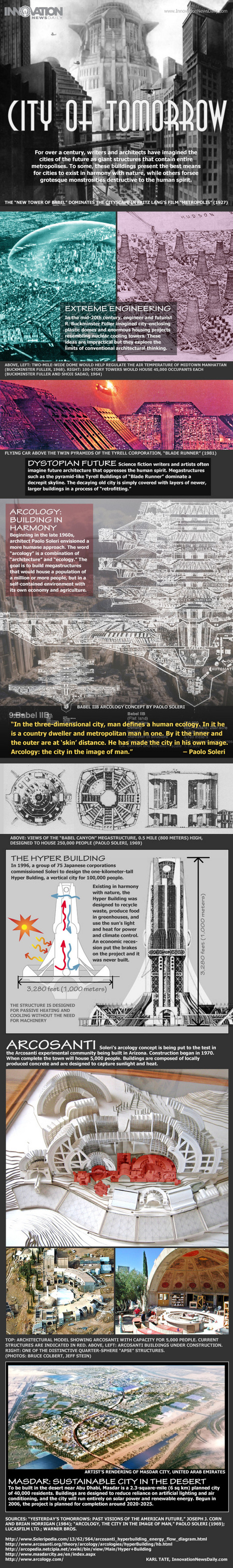
For over a century, writers and architects have imagined the cities of the future. In the late 1960s, architect Paolo Soleri envisioned “arcology” - a word that combines “architecture” and “ecology," with a goal of building structures to house large populations in self-contained environments with a self-sustaining economy and agriculture. “In the three-dimensional city, man defines a human ecology. In it he is a country dweller and metropolitan man in one. By it the inner and the outer are at ‘skin’ distance. He has made the city in his own image. Arcology: the city in the image of man.” (Paolo Soleri)
Via Lauren Moss
Data is everywhere and well-designed data graphics can be both beautiful and meaningful. As visualizations take center stage in a data-centric world, researchers and developers spend much time understanding and creating better visualizations. But they spend just as much time understanding how tools can help programmers and designers create visualizations faster, more effectively, and more enjoyably. As any visualization practitioner will tell you, turning a dataset from raw stuff in a file to a final result in a picture is far from a single-track, linear path. Rather, there is a constant iteration of competing designs, tweaking and evaluating at once their pros and cons. The visualization research community has recognized the importance of keeping track of this process. Read the complete article to learn more about the future of the practice and the tools that enable designers to create thoughtful infographics and visualizations...
Via Lauren Moss
2012 might be the year which we reached 'peak infographic'. You can’t have an issue or a piece of data without putting it into a picture so it’s easier for people to understand. While this has mostly resulted in a glut of ugly graphics that don’t actually do anything with data (and you’ll see some of these below), it’s still an incredibly simple way to get information to you fast. And this year, some of our most compelling content has appeared in the format. These are some of our favorites.
Via Lauren Moss
|
Learning by Doing
Education, like life itself, should not be a spectator sport. Merely listening or even reading may create the illusion of learning, but without active engagement, retention of course material, or the ability to apply it, is laughably low. Students who engage in hands-on activities understand concepts more deeply and remember them more accurately.
Project-based, case-based, and team-based learning and problem-solving are activity-based approaches to teaching and learning, allowing students to become creators of knowledge rather than mere recipients of knowledge.
Students might annotate a text or play or work of art, map and analyze data, visually represent change over time, document a neighborhood or community. The web can then make student projects and research publicly accessible.
By learning by doing can take even richer forms. A solver community brings together students and faculty to “crowdsource” innovative solutions to the critical challenges of our time. Tackling a real-world challenge is a proven way to nurture a community of engage, creative learners. One of the broader goals is to transform a class of students into a knowledge network, an ongoing community that can continue to partner and share expertise and insights.
Then there are maker spaces. These are innovation greenhouses, incubators, or accelerators where innovators – whether faculty, students, staff, or others from outside the campus – can work individually or collaborative on projects in a supportive environment.
A new kind of student populates many campuses defined not by demographic characteristics, but by mindset and aspirations. Extraordinarily entrepreneurial, these students, in their spare time, create apps, found start-ups, and devise creative solutions to a host of pressing environmental, health, and technology problems. Learn more / En savoir plus / Mehr erfahren: https://gustmees.wordpress.com/2015/07/19/learning-path-for-professional-21st-century-learning-by-ict-practice/ https://gustmees.wordpress.com/2014/10/03/design-the-learning-of-your-learners-students-ideas/
Via Gust MEES
'In our Data Visualization 101 series, we cover each chart type to help you sharpen your data visualization skills. Bar charts are a highly versatile way to visually communicate data. Decidedly straightforward, they can convey the message behind the numbers with impact and meaningful clarity, making complex data easy to understand at a glance.'
Via Lauren Moss

|
Scooped by
Jim Lerman
|
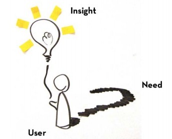
"In education, design thinking empowers students to realize that they can create their own futures by borrowing frameworks from other areas, which allows them to design their own participation and experiences. For example, game designer Katie Salen has talked about her students experiencing video game design and implementing those principles into the classroom; she said her students interact within a framework that allows them to take on social challenges as designers."
|
|
Scooped by
Jim Lerman
|
by Saga Briggs "Teachers find design thinking to be an engaging pedagogical approach, because in order to create new solutions, you cannot help but learn about people and their interests, about business or math or science or engineering. Plus, while students are learning the specific knowledge set required to develop a relevant and buildable solution, they’re also developing highly valuable skills such as empathy, the ability to collaborate, to deal with ambiguity, and, of course, to create. Design thinking offers a way to reshape the curriculum around experiences that engage students, and to shift physical classrooms based on feedback from students. "Below are 45 design thinking resources you can use to lead this movement in your own classroom:"
Cited From: http://www.opencolleges.edu.au/informed/features/45-design-thinking-resources-for-educators/#ixzz2aZJy9Hye
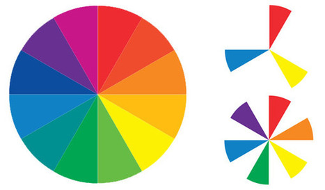
Sometimes the toughest step in building a new website or redesign can be the conceptual ones. Selecting a color palette is one of them that can be tough if you don’t have the right tools. So where do you start? It all comes down to basic color theory and the color wheel. That same tool that teachers used in school really is the basis for how designers plan and use color in almost every project from the simplest web page to expansive brands with multiple sites and campaigns...
Via Lauren Moss
A fable about using design to help your audience see your message clearly. And what to avoid. For directors, designers, instructional designers, and presenters.
Via Baiba Svenca, Jim Lerman
|


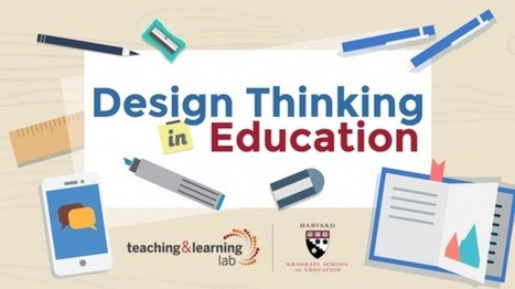


Download the Infographic:
https://tll.gse.harvard.edu/files/hgsetll/files/designthinkingeducation.pdf
Learn more / En savoir plus / Mehr erfahren:
http://www.scoop.it/t/21st-century-learning-and-teaching/?&tag=Design-Thinking
https://gustmees.wordpress.com/2014/10/03/design-the-learning-of-your-learners-students-ideas/